Nov 25, 2025
6 min read
🚙 What's Driving Australia's Transport Emissions? (Part 2)
On this page
Good Tuesday morning, and welcome to your climate data briefing.
When I started writing this, we were 86% of the way through 2025. Now we're at 90%. 🫠 🚅
This edition marks a small milestone: number 50! 🎂 Thank you so much for reading and we hope you'll stay for the next 50.
(Btw, the next stretch will see us settle into the long-promised weekly cadence. Yes, we may miss the target at times, but it's a goal with a plan. More than a ... ahem ... 'welcome outcome' 😒).
Let's return to transport emissions.
As we found in the last issue, road emissions sit in a tug-of-war: passenger cars are pulling the numbers down, while commercial vehicles are pushing them up.
Today, we'll look at the real-world forces at work and why they point in different directions.
First up, passenger vehicles.
Meep meep! 🚙
We don't take your trust for granted. You can review every source and calculation yourself.
Why it matters
- 📈 Transport is on track to become Australia's biggest source of emissions.
- 🛣️ Within transport, road emissions dwarf everything else.
- 🚙 And within roads, cars make up the biggest share.
The chart below shows how cars fit into the national emissions picture. They account for roughly 8% of our total gross emissions (excluding Land Use, which is a net negative).
Terminology note
On OnlyFacts.io, we refer to passenger vehicles simply as 'cars'. The category covers most SUVs, though not the largest ones. Below, I use cars and passenger vehicles interchangeably.
👉 Road Transport dashboard @ OnlyFacts
🚙 Big Picture: Car emissions are down
Because 2005 is the baseline for national emissions targets, that's our main comparison point. But for transport, the pre-Covid peak matters too.
Car emissions reached their highest point in 2018, before easing slightly in 2019 (more on that shortly). They plunged in 2020 and have not returned to the same level. ⤵️
Annual emissions from cars:
- 2005: 43.3 million tonnes CO2-e
- 2018: 45.7 (+6% vs 2005)
- 2023: 41.2 (−5% vs 2005)
👉 Car emissions data @ OnlyFacts
🥡 Takeaway #1: Emissions from cars are lower today than in 2005, down -5%.
Is the current lower figure only because of Covid's shadow or have real cuts taken root? To start answering that, let's look at three concrete factors.
🚙 Are there fewer cars on the road?
Of course not. Australians own more cars today than in 2005 or 2018.
Cars registered:
- 2005: 10.9 million
- 2018: 14.3 million (+33% vs 2005)
- 2024: 15.7 million (+44% vs 2005)
(Via ABS & BITRE).
Even in 2018, when car emissions were higher than in 2005, the growth in the number of cars outstripped their emissions.
Put both trends on the same chart and the gap starts to close well before the Covid collapse.
🥡 Takeaway #2: We own more cars, yet they produce lower emissions.
🚙 Are cars being used less?
Compared with the Covid peak, yes. Cars are being driven less.
- Total distance: -3% vs 2018 (-5.5 billion kms / year)
Compared with 2005, however, the answer is no. Cars are being driven more.
- Total distance: +5% more vs 2005 (+8.3 billion kms / year).
An increase of +5% over 20 years is modest. The previous 20 saw a 61% jump.
We'll look at the reasons another time (the public transport data is interesting), but for our purposes here, the point is we drive further than in 2005.
🥡 Takeaway #3: We own more cars and drive more overall, yet produce lower emissions.
🚙 What kinds of cars do we own?
Everyone knows Australians love SUVs. The charts below show the top-selling new passenger vehicles in 2005 and 2024.
Sedans and hatchbacks are shown in blue; SUVs in yellow.
See how our preferences have completely flipped.

(Note: These charts exclude light commercial vehicles, i.e. utes. That's why there's a big jump in 2024 between first and second places, RAV4 and Outlander. We'll look at utes soon.)
🥡 Takeaway #4: We own more cars, we drive more kilometres, and we buy bigger vehicles. Yet car emissions have fallen.
🚙 Emissions intensity is down
Vehicle emissions are measured by emissions intensity: grams of carbon dioxide released for every kilometre travelled. 👩🏫
Let's look at the top-selling cars again, but this time, through the lens of emissions intensity. (See the data notes at the end for how we compiled this).
Both charts below share the same x-axis so you can compare them directly. Look for the shortest bars. 👀
🥡 Takeaway #5: Passenger vehicles are far more emissions efficient today — so much so that the most popular SUVs now outperform the top sedans and hatchbacks of 20 years ago.
But there's more to the story.
Next time, we'll look at the fleet-wide average — how our love of SUVs has shaped it, and how EVs are starting to change the picture.
After all, you may have noticed the outlier in the chart above. The Tesla Model Y, an SUV with an emissions intensity of zero.👌
Quantish Reads
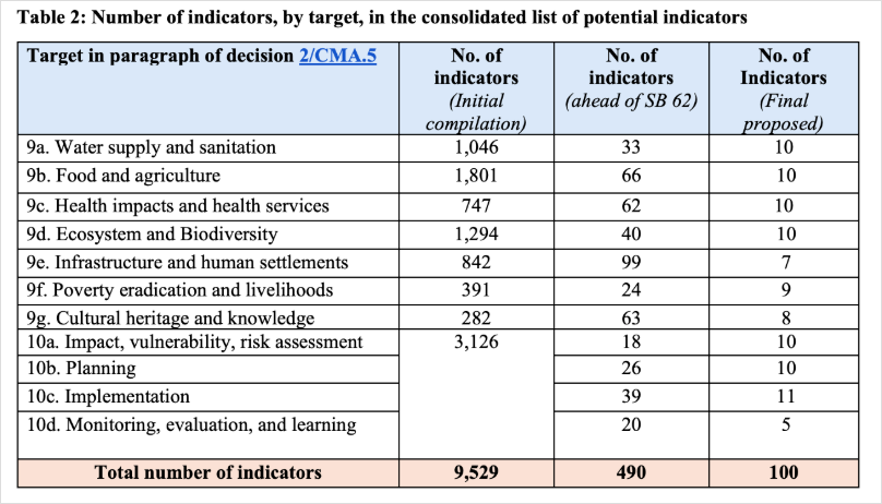
Thorough Belém wrap. The Paris Agreement created the Global Goal on Adaptation to address the cross-border fallout of inadequate adaptation to climate change. One sticking point is how to measure progress. Experts narrowed a list of 10,000 indicators to 100 for negotiation at COP30. The African Group warned some intruded on their sovereignty; Australia said some resembled a 'finance tracking regime'. The final text settled on 59. (CarbonBrief; image from CarbonBrief Q&A)
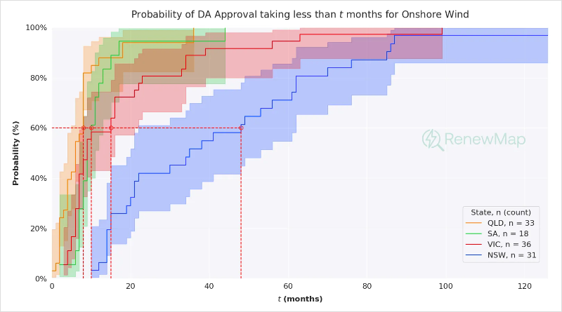
A statistical analysis of renewable projects in Australia using a method borrowed from medical research. Instead of predicting a patient's survival over time, it estimates a project's chance of reaching completion. The results show wild variation with a clear pattern by technology and state. The time it took for 90% of onshore wind projects to reach completion: 17 months in South Australia, 18 in Queensland, 39 in Victoria, and 85 months (seven years) in New South Wales. (RenewMap)
Data Updates
☀️ Renewables by Grid (updated daily)
This month so far, renewables' share of electricity in the main grids:
🇦🇺 Renewables by State (updated daily)
This month so far, renewables' share of electricity in each state and territory:
- 🥇 TAS: 101.5% (+17.3 percentage points vs. November 2024)
- 🥈 SA: 91.5% (+11.6 pp)
- 🥉 WA: 56.3% (+7.9 pp)
- VIC: 51.2 % (+3.3 pp)
- NSW: 48.5% (+6.1 pp)
- QLD: 39.5% (+5.3 pp)
(NTESMO and NT data excluded while under review).
Final Thought
'A committee is a group of people who individually can do nothing, but as a group decide nothing can be done.'
— Ranulph Fiennes
That's your climate data briefing. Wishing you a great week ahead! We'll be back in your inbox very soon.
💛 Juliette and the OnlyFacts team
Need dashboards, analysis or data-driven content? We level the data playing field by working with Davids, not Goliaths.
Data notes
How we compiled emissions intensity data:
- The 2024 vehicle data comes from figures published by the National Transport Commission in December 2024. These represent the average emissions intensity for models sold in 2023.
- The 2005 vehicle data comes from the Vehicle Emissions Star Rating website. For each model, we collected and averaged the tailpipe CO₂ g/km for all body types and variants in a model’s range that included 2005.
- Where 2005 data wasn’t available, we used the closest year:
- Toyota Camry: 2006
- Toyota Corolla: 2007
- To check our method, we calculated emissions-intensity figures for 2023 models using the same approach and confirmed they roughly matched the NTC figures.