Jun 14, 2026
6 min read
☀️📉 Real Cuts or Doing Less? (Quarterly Emissions Update, Part 1)
On this page
Good Sunday evening and welcome to your climate data briefing. ⚽️
This newsletter brings you one analysis, two quantish reads, and three data updates.
A couple of weeks ago, Australia's quarterly greenhouse gas inventory was published. 📣
These updates are sometimes read in a simple way … emissions are up or down, and that is good or bad.
A more useful way to understand them is why emissions are up or down. What drove the change?
Let's dive in. 🤿
Headline Figures: Emissions are Falling
The latest update gives detailed data for the year to December 2025, and preliminary data for the year to March 2026.
Both show Australia's national net emissions falling:
- December 2025: 458.9 Mt (-2.1%)
- March 2026: 457.7 Mt (-1.4%)
If the March figures hold, Australia's emissions are now 24.7% below 2005 levels.
The 2030 target is 43% below 2005 levels. To hit that, emissions need to fall by roughly 4.6% a year. So, yes, we're off pace 🐢 ... But that's not our focus here.
Not All Falls Mean the Same Thing
Emissions are reported by sector, which means they reflect different stories playing out across the economy.
The Department of Climate Change, Energy, the Environment and Water (DCCEEW) gives brief details about the drivers behind emissions changes.
We've split those details into two groups:
- ☀️ Real cuts = emissions fell because of abatement, efficiency, or cleaner production
- 📉 Volume-related changes = emissions changed because we did more or less of an emissions-producing activity
Here's the breakdown:
(For December 2025 data)
-
Electricity 145.8 Mt · ▼ 3.8%
☀️ Real cut: fossil fuel generation fell -
Transport 100.8 Mt · ▼ 0.6%
☀️ Real cut: petrol use fell
📉 Volume-related: diesel use and jet fuel use rose -
Stationary energy, excluding electricity 97.0 Mt · ▼ 1.6%
☀️ Real cut: gas use in homes fell
📉 Volume-related: gas extraction fell -
Agriculture 76.2 Mt · ▼ 0.1%
📉 Volume-related: livestock rose -
Fugitive emissions 45.9 Mt · ▼ 5.2%
☀️ Real cut: carbon capture rose
📉 Volume-related: coal mining fell -
Industrial processes and product use 31.7 Mt · ▲ 3.0%
📉 Volume-related: steel production and ammonia production rose -
Waste 13.5 Mt · ▼ 1.7%
☀️ Real cut: methane capture rose -
Land use and forestry net sink −52.0 Mt · ▲ 0.3%
☀️ Real cut/removal: sequestration fell
Over the next few weeks, we'll look at the data that teases out these drivers.
Today, we start with the two biggest emitting sectors: electricity and transport.
Electricity: Australia’s Clearest Decoupling Story
Electricity is the, ahem, shining light of emissions reductions. 💡
Year to December 2025:
- Electricity emissions: 145.8 Mt CO₂-e (-3.8%)
As emissions fell, electricity generation rose.
Year to December 2025:
- Electricity generated (NEM & SWIS): 240 TWh (+2.0%)
The driver was fuel-switching across the grids: 'record renewables generation and the ongoing displacement of coal and gas'.
The result is a striking demonstration of decoupling. More electricity no longer means more emissions.
Transport is still waiting for its decoupling moment
Even though emissions fell slightly in the last update, transport tells a different story.
Year to December 2025:
- Transport emissions: 100.9 Mt CO₂-e (-0.6%)
That's a small drop 🤏 but the DCCEEW analysis struck a celebratory tone 🎊 saying the results 'are signs of transport emissions nearing or having reached their peak'.
The key driver was petrol consumption. 🚗
Year to December 2025:
- Petrol consumption: 15.8 billion litres sold (-2.8%)
The chart above shows petrol consumption has been falling for about 20 years. What made 2025 different is that it was the first fall since the Covid recovery. Covid obscured the longer structural decline and we now seem to be back on that path.
🥸 But petrol isn't the only thing driving transport emissions.
If we put petrol consumption and transport emissions on the same chart, indexed to 2006, we can see they parted ways long ago.
Petrol use has been falling, while transport emissions have been rising.
2025 versus 2006:
- Transport emissions: +20%
- Petrol consumption: -17%
That means transport emissions have other key drivers. One of them is diesel. 🚚 🛻
Diesel consumption rose in the year to December 2025, partially offsetting the gains from lower petrol consumption.
Year to December 2025:
- Diesel consumption: 33.5 billion litres sold (+0.3%)
2025 vs 2006:
- Diesel consumption: +110%
The other activity partially offsetting emissions reductions was jet fuel. ✈️
Year to December 2025:
- Domestic jet fuel sales: 4.2 billion litres sold (+4.2%)
2025 vs 2011 (earliest available data):
- Domestic jet fuel sales: +28%
For transport to show real abatement, we would need to see something like the electricity chart – emissions falling while activity rises.
In transport, activity can be gauged by how much we move around. Datapoints like:
- Total vehicle kilometres driven
- Domestic flights flown
(Shipping and rail are also in transport emissions, but make up a small fraction).
We pulled road kilometres and domestic flight data, then indexed them against emissions.
The trend shows the opposite of electricity. There is little daylight between emissions and activity.
👉 Transport emissions still move closely with the number of kilometres we drive and flights we take.
Emissions track particularly closely with road kilometres. This comes as no surprise, because even though DCCEEW cited jet fuel as one reason emissions reductions were partially offset, road emissions are roughly 9x aviation emissions.
One of the many agonies of collecting data from different sources is that some series always lag others. 🫠
In this case, the activity data is running behind the emissions data. The latest emissions data is nine months ahead of the latest road and flight activity data we could find.
So, in a slightly absurd twist, emissions data is now acting as a leading indicator of activity data. 🙃
But based on the emissions and fuel consumption figures, plus the department's explanation that EVs and hybrids are helping drive cuts, we expect to see something important in the next activity update - people driving more than ever, while transport emissions fall.
That would be the transport version of decoupling.
For now, the transport data shows little sign of that. The trend remains mostly activity-based.
But if EVs and hybrids keep taking market share from petrol and diesel, the signal should appear soon.
Quantish Reads
A Tale of Two Oil States
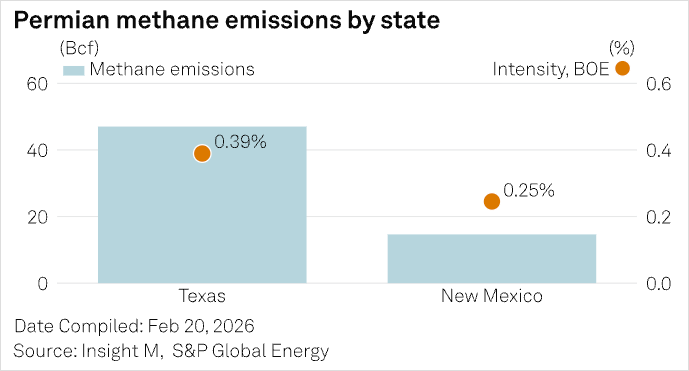
The Permian Basin is a huge oil-producing region that straddles Texas and New Mexico in the USA. In 2025, producers reported a 23% fall in methane emissions intensity. But the basin-wide average hides state differences. 'Two jurisdictions, same basin, same geology, yet methane intensity in Texas runs materially higher than in New Mexico'. One likely reason is regulation. In recent years, New Mexico introduced stricter methane controls, while Texas' regulatory framework is more flexible. Another factor was data collection, with more frequent aerial observations detecting leaks sooner. (S&P Global)
Solar overtakes gas in Asia
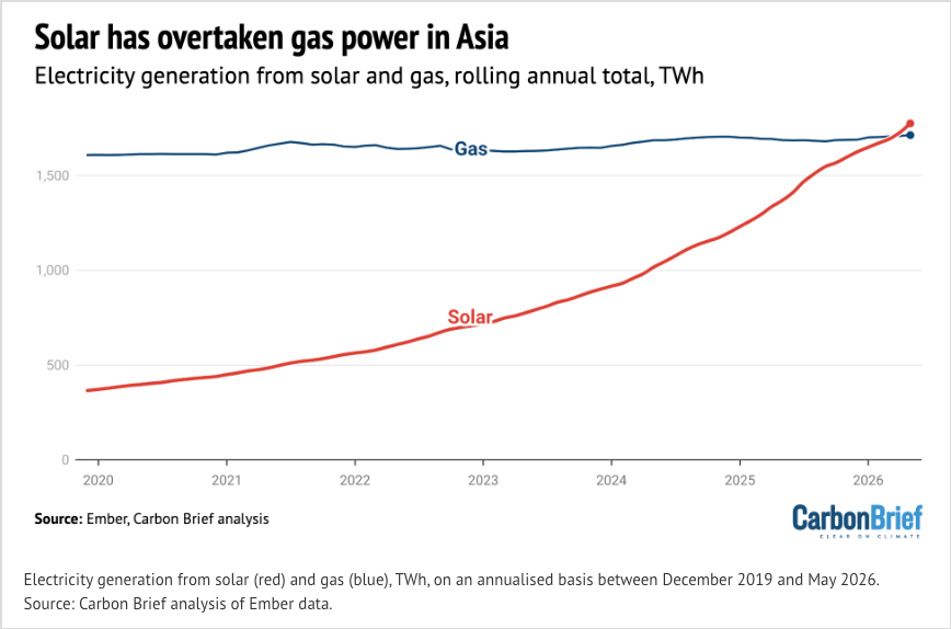
Coal and hydropower remain Asia's biggest electricity sources. In third place was gas, which was expected to undergo 'explosive growth' across the region. But supply disruptions, high gas prices, and the growth of clean alternatives have interrupted that forecast. Meanwhile, solar has surged. The result is solar has overtaken gas to become Asia's third-largest source of electricity. Since 2020, solar output has risen nearly fourfold, driven by India, Pakistan and, especially, China. (CarbonBrief)
Data Updates
☀️ Renewables in the Grids
June 2026 so far (vs June 2025)
👀 If June continues like this, NTESMO will eclipse the SWIS for renewables penetration for the first time.
🚙 Car Sales
Percentage of total new car sales in May 2026 (vs May 2025)
🔋 Battery installations
Top postcodes as of April 2026
- 5120 – Virginia (SA) + 2 more: 12 per 100; 337 total units
- 5117 – Angle Vale: 10 per 100; 403 total units
- 5371 – Roseworthy + 3 more: 9 per 100; 119 total units
- 2765 – Riverstone + 12 more: 6 per 100; 2,772 total units
- 2899 – Norfolk Island: 6 per 100; 124 total units
- 6034 – Eglinton: 5 per 100; 179 total units
- 5582 – Stansbury + 1 more: 5 per 100; 29 total units
- 5501 – Two Wells + 13 more: 5 per 100; 383 total units
- 2179 – Austral + 1 more: 5 per 100; 753 total units
- 2769 – The Ponds: 4 per 100; 719 total units
- 5141 – Summertown + 1 more: 4 per 100; 34 total units
- 3335 – Plumpton (Vic.) + 4 more: 4 per 100; 272 total units
- 5451 – Auburn (SA) + 1 more: 4 per 100; 30 total units
- 5222 – Island Beach + 17 more: 4 per 100; 28 total units
- 4799 – Bloomsbury + 1 more: 4 per 100; 39 total units
- 5136 – Norton Summit: 4 per 100; 22 total units
- 3916 – Shoreham + 2 more: 4 per 100; 41 total units
- 5243 – Oakbank: 4 per 100; 34 total units
- 6286 – Witchcliffe + 3 more: 4 per 100; 33 total units
- 5121 – Macdonald Park + 3 more: figures not supplied in extract
That's your climate data briefing. Thanks for reading, and wishing you a great week ahead.
💛 Juliette and the OnlyFacts team

Custom tools and content that make evidence easier to understand and harder to ignore.